
Circle ²
Interface Redesign for the Synthesizer Application Circle², providing a forward-thinking interpretation of Circle’s esteemed user-centred design approach.
Afterwards the client had a few questions:
And I answered them in a brief interview:
Looking back at Circle 1, what was key in the design of its interface?
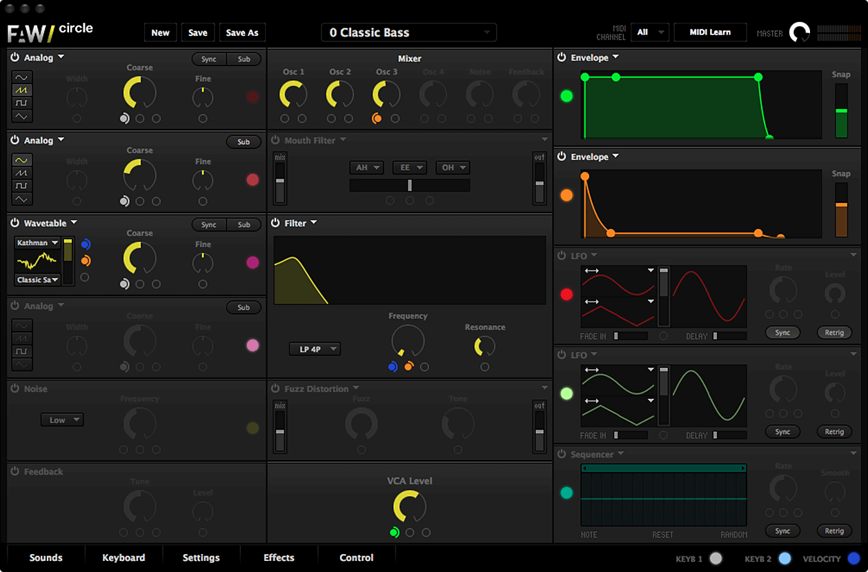
I think the design language of Circle 1 is a good mixture of a flat, minimalistic approach and a detail-oriented simulation of textures and shadows. The way that Circle balanced these elements is very attractive. But we thought that it was slowly but surely the time to overhaul certain elements, especially structures that gave the user the feeling of handling a device from the physical world. Circle certainly used this technique sparingly, so that the interface surely can’t be described as skeuomorphic, but we felt that some elements were out-of-date in contemporary interface design.
What was your approach for the redesign?
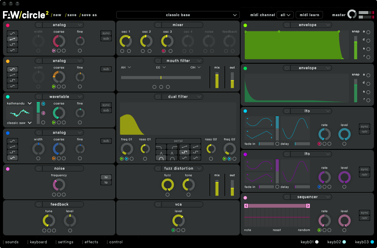
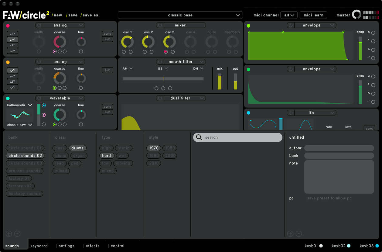
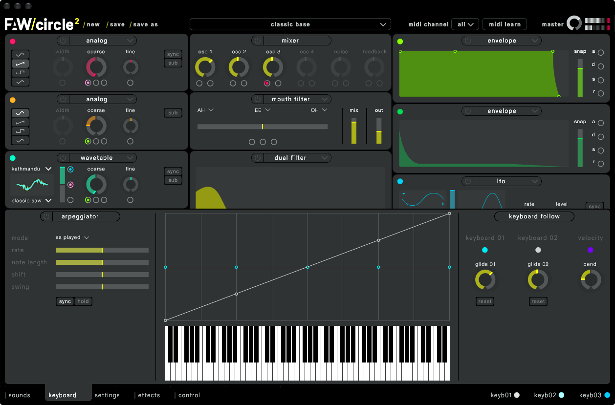
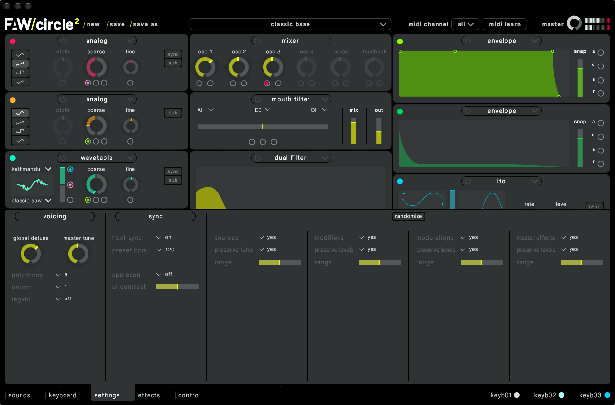
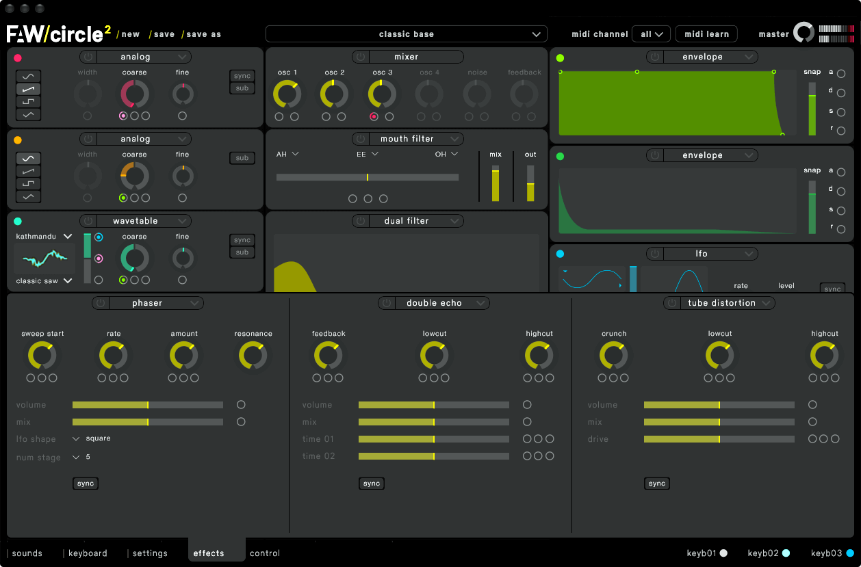
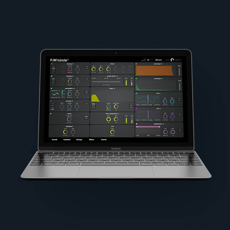
Our goal was to construct a flat design with even brighter, more distinct colors. In doing so, we were able to improve Circle’s most prominent features: the clarity of the arrangement of the interface and the ease of figuring out the synth’s capabilities. Designing a synthesizer to be simple is a difficult task since it is a complex application in which many elements are dependent on each other. After breaking down the interface into its small components and reworking certain parts, everything has to fit together again as a whole. For making Circle² the best synthesizer in terms of intuitiveness, the interface design doesn’t just have to look good, but has to feel good to the musician.
Can you give us examples on details that were reworked?
The most distinguishing design elements in Circle are the circles that control the synthesizer’s modules. If you look at Circle 1’s interface, these circles come in different sizes: For example, the circle to manipulate the filter’s cutoff has a larger diameter than the filter’s resonance control, which resembles the look of common hardware synthesizers. This allusion to physical synthesizers didn’t make sense for us anymore and has been exchanged for a flatter, contemporary design language. We found that on a screen, a flatter design enables the human eye to grasp all information much more speedily and comfortably.
Did you have different approaches for users who just discovered Circle² and existing Circle fans?
Circle 1 was already great in bringing an order to the complexity of a synthesizer, which is why we kept most features where they used to be. The interface will therefore already be familiar to existing Circle users. The greatest change will be in the experience of the synthesizer: Using Circle² will look and feel better, which will make using it a lot more fun. For new users, we hope that the Circle’s message has even more impact: By being focused on simplicity and intuitiveness, Circle will assist you in your creative flow when making music.


© 2020 Lars Hammerschmidt, Berlin - CV | LinkedIn | Tumblr | Soundcloud | Vimeo